


Guinness 健力士浪涌漫游快闪 上海
 作者: editor01
 代理商:
不确定
项目信息
项目品牌: 健力士
项目行业: 酒精饮品
项目日期:
 2026-11-03 10:00
2026-11-03 22:00
项目地点: 上海 西岸梦中心·市集广场
项目名称: Guinness 健力士浪涌漫游快闪 上海
项目信息:西岸梦中心
2026 年 11 月,健力士把「浪涌漫游」限时体验空间搭在上海西岸梦中心·市集广场的露天场地上。它没有做成封闭的展馆,而是用一组白色门楼和黑色灯箱在广场上围出一段通道,让人从滨江步道拐进来,就走进了品牌的叙事里。
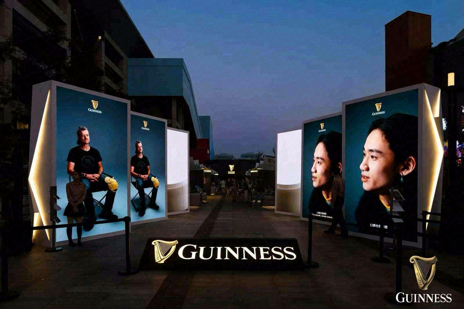
空间与造型:白色门楼
入口是一道白色的拱形门楼,门楣与侧板的黑色灯箱上反复出现 GUINNESS 字样。
232°C:烘焙动线
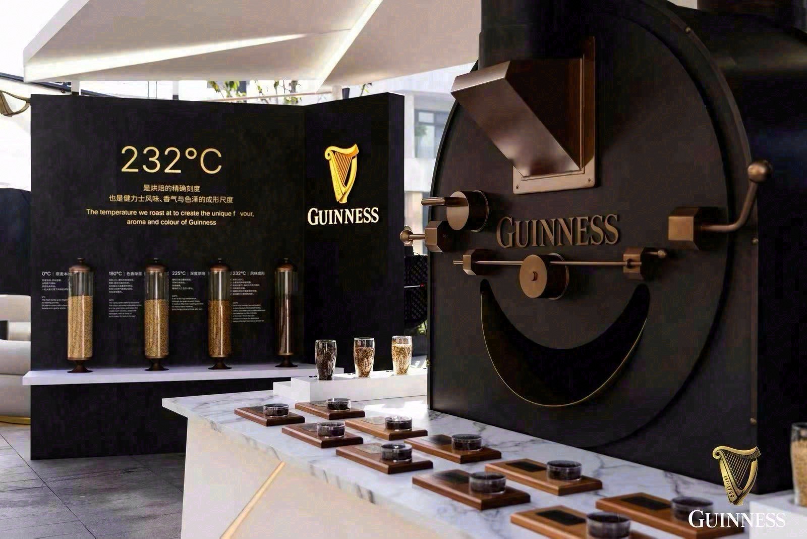
穿过门楼,正对的是被命名为「232°C ROAST ATELIER」的烘焙展示带:0°C、190°C、225°C、232°C 四个温度节点依次排开,配着一句英文说明——232°C 是烘焙大麦的温度,正是这个温度赋予健力士独特的风味、香气与颜色。品牌没有把工艺做成抽象的图表,而是把温度本身变成了可以走过去的动线。
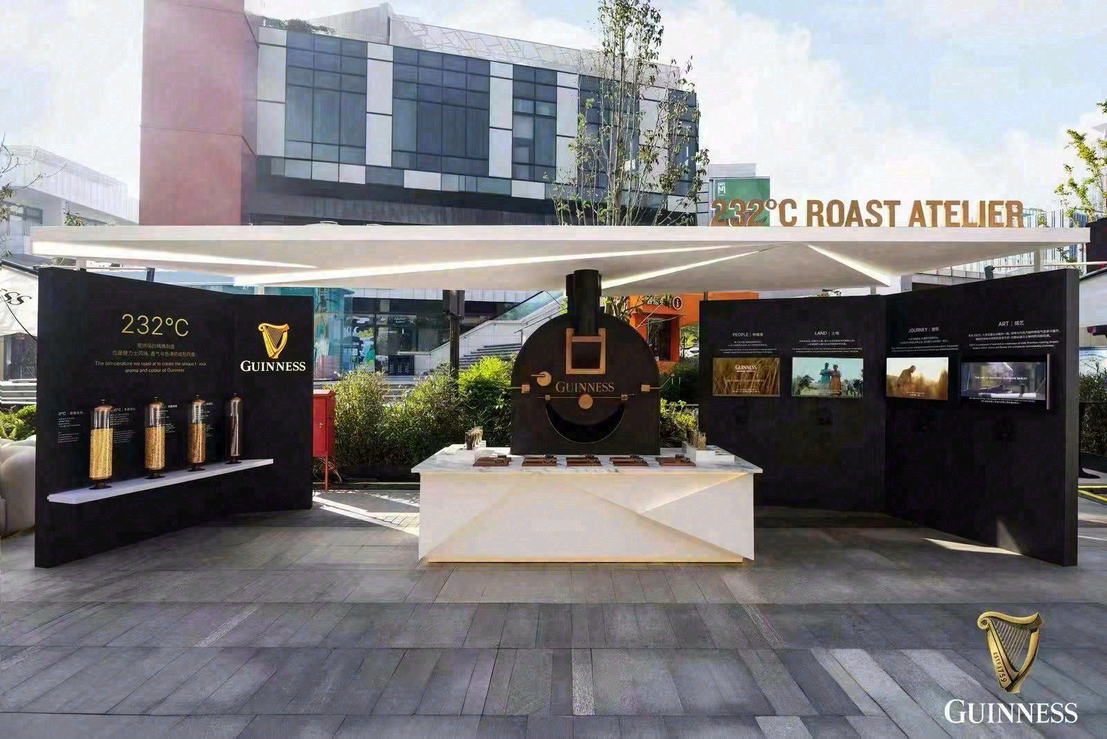
色彩与材质:黑白木
空间的色彩关系被压到极简:白与黑构成骨架,浅色木质铺装托底,灰色地面延伸出去,绿色植物在吧台与座位之间做点缀。休息区由白色沙发和白色吧台组成,配合暖色灯光,白天是开放的会客区,入夜后灯光亮起,黑色灯箱上的白色字反而更清楚。所有装置都做得轻,不遮挡滨江的天际线,也不与广场原有的商业界面争夺注意力。
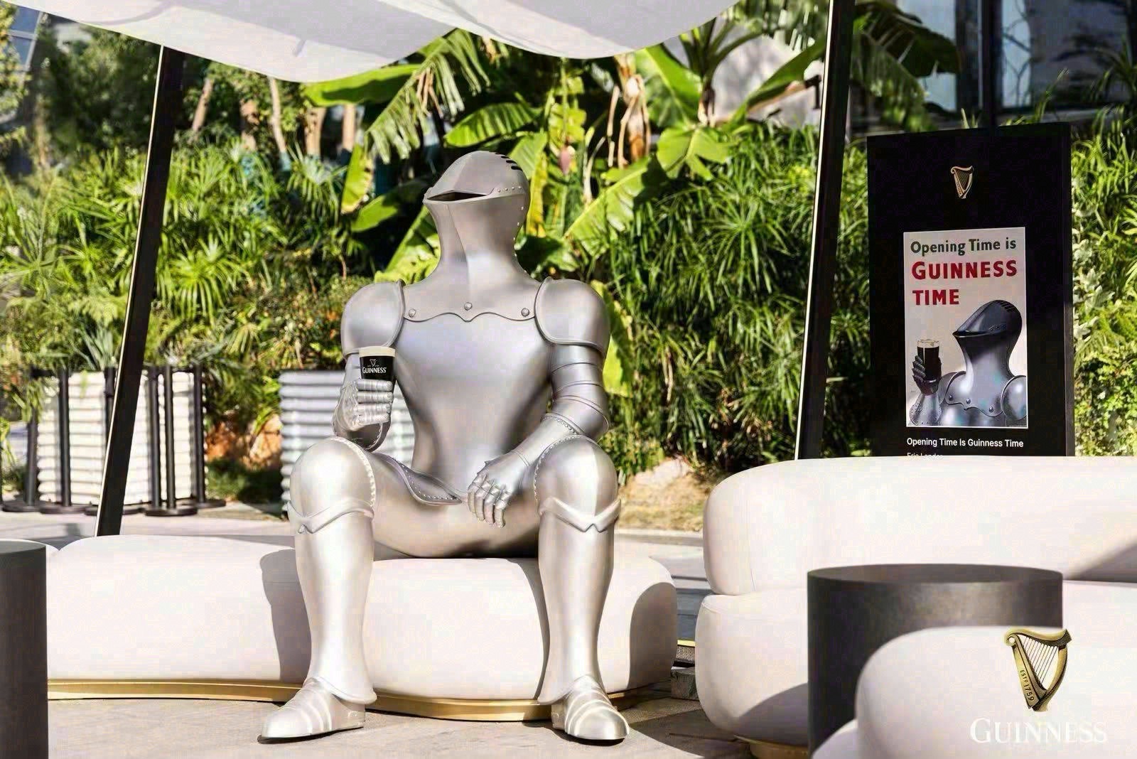
传播与营销:举杯即内容
现场最容易被拍下来的是那句标语——Opening Time is GUINNESS TIME。它被放在门楼和吧台视线齐平的位置,人只要举起杯子,画面里就自然会带上这句话。这正是这类限时空间在传播上的作用:不需要额外的舞台和演出,把「举杯」这个动作本身变成内容,让到场的每一个人替品牌完成拍摄与发布。
制作与执行:可拆装模块
从制作角度看,这套空间靠的是标准化的模块:门楼、灯箱、温度立柱、吧台和座位区,都是可以在不同城市拆装重组的单元。对一个需要反复进入不同场地的啤酒品牌来说,这种轻量结构比一次性的大型搭建更实用——搭建周期短,对场地条件要求低,同一套语言换一个城市还能继续用。
把工艺可视化、把标语放在举杯的高度、把结构做成可复用的模块,健力士这次的「浪涌漫游」没有讲一个复杂的故事,它只做了一件事:让一杯啤酒背后的 232°C,变成可以在露天广场上走一遍的路。
Guinness | "Surge Roam" Limited-Time Experience Space (West Bund Dream Center, Shanghai) | November 3, 2026 | Market Plaza, West Bund Dream Center, Xuhui, Shanghai, China
In November 2026, Guinness opened "Surge Roam", a limited-time experience space, on the open-air piazza of West Bund Dream Center in Shanghai. Rather than enclosing itself in a pavilion, the brand marked out a passage across the square with a run of white gateways and black light boxes, so that anyone turning in from the riverside promenade walked straight into the story.
The entrance is a white arched gateway, its lintel and side panels carrying the GUINNESS wordmark on black light boxes. Beyond it sits an area labelled 232°C ROAST ATELIER: four temperature points — 0°C, 190°C, 225°C and 232°C — are set out in sequence alongside an English line explaining that 232°C is the temperature at which the barley is roasted, the point that gives Guinness its distinctive flavour, aroma and colour. The craft is not presented as a chart to be read but as a route to be walked.
The palette is deliberately reduced: white and black form the structure, pale timber decking carries the floor, grey paving runs out toward the river, and green planting sits between the bar and the seating. The rest area is built from white sofas and a white bar counter under warm lighting; by day it reads as an open lounge, and after dark the black light boxes make the white lettering sharper than ever. Every element is kept light so that the riverside skyline stays visible and the square's existing retail frontage is not overshadowed.
The line most likely to end up in a photograph is the one set at eye level on the gateway and the bar: Opening Time is GUINNESS TIME. Raise a glass anywhere in the space and the sentence comes with it. That is the communications function of a room like this — no stage and no performance are needed, because the act of raising a glass becomes the content, and every visitor finishes the shoot and the post on the brand's behalf.
From a production standpoint the space relies on standardised modules: gateway, light boxes, temperature columns, bar counter and seating, all of which can be dismantled and rebuilt in another city. For a beer brand that has to keep entering different sites, a lightweight kit is more practical than a one-off build: the install cycle is short, the demands on the venue are low, and the same language can travel.
Make the craft visible, put the line at the height of a raised glass, build the structure as a reusable kit — Guinness's Surge Roam does not tell a complicated story. It does one thing: it turns the 232°C behind a glass of stout into a route you can walk across an open square.
What the layout does well is sequence. A visitor arrives from the promenade, passes under the wordmark, meets the temperature line, and only then reaches the bar — the product arrives last, after the explanation. That order matters for a beer whose appeal is bound up with how it is poured and how it looks in the glass. By the time someone is handed a pint, the black liquid, the settling surge and the creamy head have already been framed by the four temperatures they walked past.
The seating does the quieter half of the work. White sofas and a white counter sit at the edge of the route rather than at its centre, so people can stay for a second drink without blocking the flow, and the photographs they take include the gateways and the lettering behind them. Nothing in the space demands a particular pose; the structures simply make the obvious pose — glass raised, wordmark behind — easy to find. For a brand that lives on social images, that is a more efficient form of set design than a decorated stage.
It is also worth noting what the build leaves out. There is no ticketing, no enclosed queue, no dark room, and no screen wall competing with the river view. The whole intervention reads as furniture for a public square: light enough to install in days, open enough to be entered by accident, and legible from twenty metres away. That restraint is what allows a global beer brand to occupy a local retail piazza without overpowering the tenants around it, and it is the reason the same kit can be shipped to the next city with only the site plan changed.
-end-
图片及内容来自网络及品牌公开信息,出处见网络
文字来自 AI 编辑完成,AI信息自我辨识
 x

